
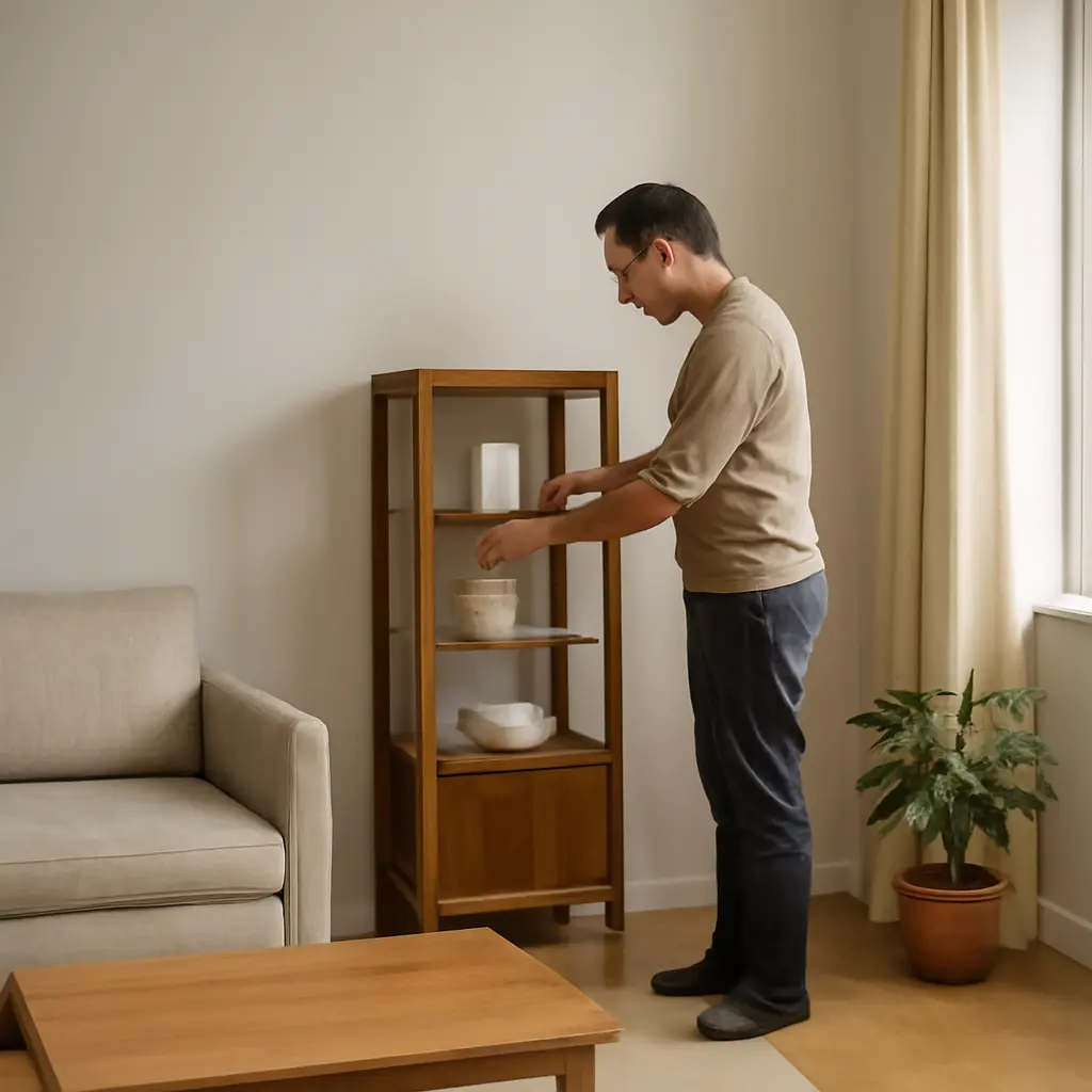
Small display cabinets feel spacious when their interiors make objects easy to see, distinguish, and reach without crowding the available volume. A practical layout combines selective editing, vertical and visual breathing room, layered lighting, and storage matched to the objects on display. These choices matter in compact homes: the U.S. Census Bureau reported that the median size of a new single-family home sold in 2023 was 2,286 square feet, while many households must arrange furnishings around limited room and storage. The sections below explain how cabinet proportions, shelf spacing, color, lighting, and real-world display choices can make a small cabinet appear more open and work more effectively.
Interior Layouts: How Display Cabinet Proportions Create a Spacious Feel
A display cabinet interior layout is the arrangement of shelves, objects, lighting, and empty space inside a cabinet. There is no single industry-standard formula for making a cabinet look spacious, but interior-design guidance commonly relies on visual balance, clear sightlines, and avoiding unnecessary clutter. The American Society of Interior Designers describes interior design as shaping spaces to support both function and human experience; applied to a cabinet, that means making contents legible and accessible as well as attractive.
The relevant layout types include open-looking arrangements with fewer objects, vertically organized arrangements that emphasize height, and grouped displays that create order through repetition. These approaches work best when the cabinet’s contents suit its dimensions. A narrow cabinet, for example, benefits from a restrained number of objects and clear vertical lines, while a deeper cabinet can use front-to-back layering without hiding every item behind another.
Shelf spacing and usable volume
Shelf spacing is the vertical clearance between shelves. Adjustable shelves let the interior fit the objects rather than forcing objects into arbitrary gaps. Measure the tallest item in each group, including handles or decorative tops, and leave a visible margin above it. That margin prevents the display from looking compressed and makes objects easier to remove.
Use a mix of shelf heights when the collection varies: taller openings for vases or framed pieces, and shorter openings for bowls, books, or small collectibles. Avoid making every shelf equally full. One deliberately open shelf can function as visual breathing room and help the eye distinguish the objects on neighboring shelves.
Sightlines, depth, and object scale
A sightline is an unobstructed view through or across a display. In a glass-front cabinet, placing large pieces toward the back and smaller pieces toward the front can create depth, provided the front objects do not obscure the collection. Keep especially prominent pieces away from door frames and hardware, which can visually cut across them.
Scale also affects perceived spaciousness. A few appropriately sized objects usually read more clearly than many tiny pieces scattered across a shelf. As a practical test, step back to the usual viewing distance: if individual objects merge into a busy pattern, remove or regroup some of them.
Object Grouping and Negative Space in Small Display Cabinets
Negative space is the unoccupied area around and between objects. It is not wasted capacity: it separates shapes, clarifies a display’s focal point, and makes a small interior easier to read. This principle connects directly to object grouping. When similar items are arranged together, the empty areas around each group help the collection appear intentional rather than crowded.
Grouping by theme, material, or color
A grouped display collects related items by a shared feature, such as material, color, function, or subject. For instance, a small run of ceramic cups can be presented together, while a single contrasting piece serves as an accent. Repeating a color or material across shelves creates continuity and reduces the impression of visual noise.
A simple editing method is to select one focal object for each shelf and arrange supporting pieces around it. Vary heights and silhouettes, but avoid giving every object equal prominence. This produces a clear hierarchy: the eye can identify the main piece first and then explore the details.
Editing collections and preserving breathing room
Editing means deciding which items deserve space in the cabinet and rotating the rest into storage or another display. It is especially useful for collections that grow over time. Rather than filling every shelf, leave visible gaps between groups and keep the cabinet’s most meaningful or frequently enjoyed pieces in view.
A useful review is to remove everything, clean the shelves, and return items in priority order. If the display still feels crowded, rotate seasonal or secondary objects instead of adding another layer. This approach protects both visual clarity and practical access.
Color, Glass, and Lighting for a More Open Cabinet Interior
Color, transparency, and light influence how clearly a cabinet’s interior reads. A coordinated background can help objects stand out, while glazing and illumination can make the cabinet feel less like a solid block of furniture. These effects depend on the room: reflections, sunlight, and nearby wall colors can change how glass and finishes appear.
Background color and visual continuity
A light or low-contrast cabinet interior often feels visually quieter because its surfaces compete less with the objects. Matching the cabinet’s interior to nearby walls can also soften its visual boundaries. Dark interiors are not automatically wrong: they can make pale ceramics or glassware stand out, but they may feel more enclosed when the cabinet is already deep or poorly lit.
Test color with the actual collection in place. A sample board or removable shelf liner helps reveal whether the background improves contrast or makes objects disappear. Choose finishes that can be cleaned safely, especially if the cabinet holds items that collect dust or require frequent handling.
Glass doors, reflections, and visibility
Glass doors maintain a visual connection between a cabinet and the room, but glare can obscure the display. The National Fenestration Rating Council explains that visible transmittance measures how much visible light glazing allows through; this is a useful glazing concept, although cabinet glass specifications and coatings vary by product. Clear glass tends to preserve color, while reflective or tinted glass can change the appearance of objects.
Check the cabinet from the room’s main viewing angles at different times of day. If reflections dominate, adjust nearby lighting or the cabinet’s position before changing the display. Keep glass clean and avoid placing bright light sources directly opposite it when possible.
Layered lighting and safe illumination
Layered lighting combines ambient room light with focused cabinet lighting. Small, concealed LED fixtures can brighten shadowed shelves and improve color recognition without taking up display space. The U.S. Department of Energy notes that LEDs use at least 75 percent less energy and last up to 25 times longer than incandescent lighting, making them a practical option for many cabinet installations.
Choose fixtures designed for enclosed spaces, follow the manufacturer’s installation and heat-clearance guidance, and route wiring so it does not interfere with shelves or doors. For light-sensitive objects such as works on paper, textiles, or some collectibles, limit exposure and follow conservation advice; added brightness is not always appropriate.
Storage Zones and Access in Compact Display Cabinet Layouts
A compact cabinet can combine display and storage if the two functions are clearly zoned. Display zones keep selected objects visible; storage zones conceal practical or less decorative items. Separating them prevents useful belongings from competing with the focal display and makes everyday items easier to find.
Display shelves versus concealed storage
Place frequently admired or visually distinctive pieces on open-view shelves, and reserve drawers, lower cupboards, or opaque containers for supplies and less attractive necessities. Heavier objects generally belong on lower shelves for stability and easier handling. Keep fragile pieces away from door edges and locations where they may be knocked during routine use.
If the cabinet has only glass shelves, small trays or low-sided organizers can keep related objects together without creating a bulky visual barrier. Choose containers that fit the cabinet’s depth and can be removed easily for cleaning.
A practical layout example
Consider a narrow living-room cabinet holding glassware, a few books, and keepsakes. The top shelf can display one taller focal piece with space around it; the middle shelves can group glassware by type and leave a gap between groups; and the lower section can hold books or concealed supplies. A small LED strip placed according to the cabinet maker’s guidance can lift shadows, while a light, calm backing can help the contents remain distinct.
This example can be adapted to a kitchen hutch, a collectible cabinet, or a bathroom display cupboard. The key is to choose the layout according to the items’ size, weight, fragility, and frequency of use rather than filling every available shelf.
Conclusion: A Clear, Balanced Interior Makes a Small Cabinet Feel Larger
Small display cabinets feel more spacious when their proportions support the objects, their groupings preserve negative space, and their finishes and lighting maintain clear sightlines. Adjustable shelf spacing, restrained editing, coordinated backgrounds, and sensible storage zones help a cabinet look composed while remaining useful. Start by measuring the cabinet and its contents, then arrange a few priority pieces, step back to assess the view, and revise before adding more. For further guidance, consult the cabinet manufacturer’s installation instructions and conservation recommendations for any delicate objects.
Sources: U.S. Census Bureau, Characteristics of New Housing, 2023, https://www.census.gov/construction/chars/; American Society of Interior Designers, About Interior Design, https://www.asid.org/about/what-is-interior-design; National Fenestration Rating Council, Energy Performance Ratings, https://nfrc.org/energy-performance-label/; U.S. Department of Energy, LED Lighting, https://www.energy.gov/energysaver/led-lighting.